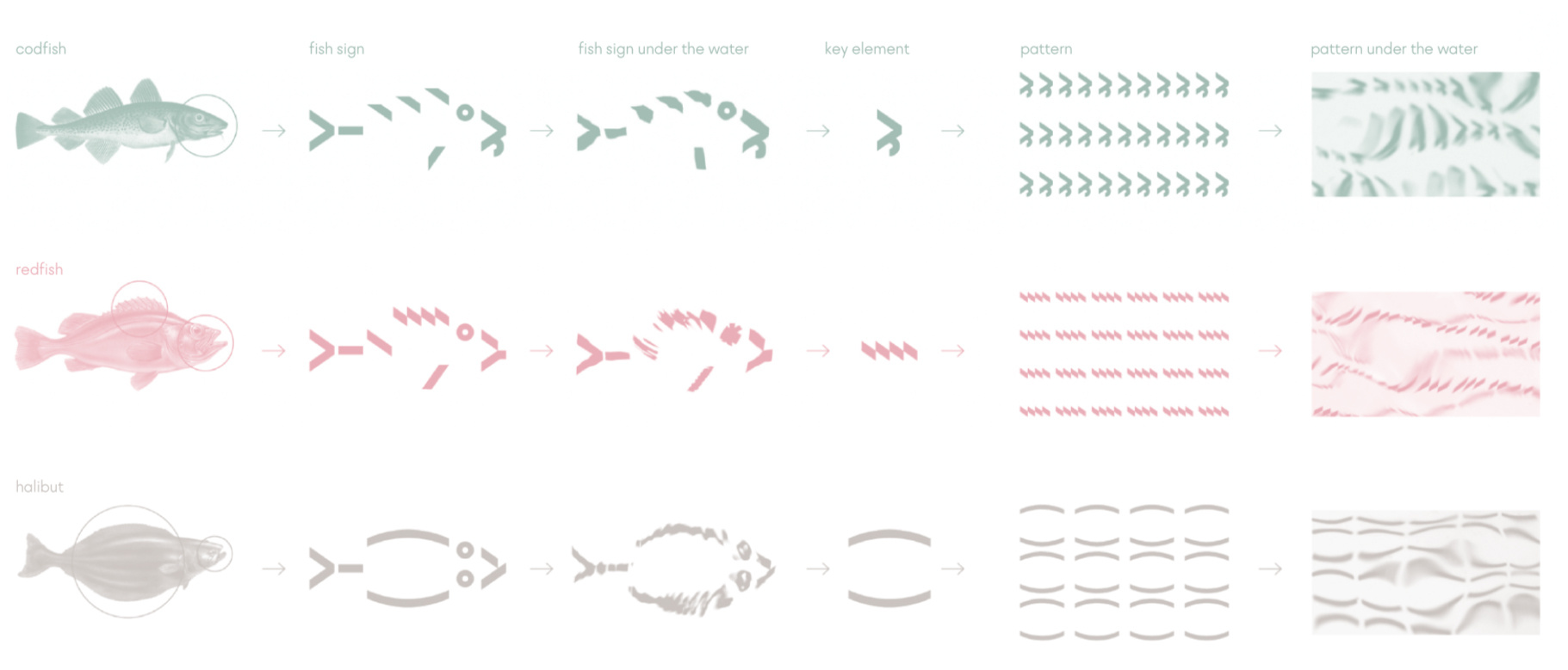
The visual concept of borealis reflects the uniqueness of the wild northern fish. To create it, we together with an expert ichthyologist dived into the underwater world and studied the external and behavioral characteristics of each fish species.
The characteristic features of each fish are the result of it's evolutionary history. So, the halibut who lives on the bottom of the sea, took a flat shape under water pressure. The cod's antennae developed as an organ of touch for hunting.
While creating a unique brand design, we developed a system of graphic elements showing the uniqueness of each type of fish and a font containing characters associated with its special visual features. We got the stylish patterns of borealis line as a result of an experimental approach, placing the developed graphics under the sea waves.
Thus, each type of fish and seafood in borealis line has it's own sign, font graphics and unique pattern, created with the participation of the northern nature.

